The agency requires a rebrand to keep up with the constantly evolving market demands and to maintain its competitive edge in the industry. The project’s primary goal is to create a new brand identity that reflects the agency’s strengths, values, and expertise.
The agency is facing the challenge of keeping up with constantly evolving market demands and maintaining a competitive edge in the industry. Their current brand identity must effectively reflect the agency’s strengths, values, and expertise, hindering their ability to attract and retain clients. There is a need for a comprehensive rebranding solution that aligns with the agency’s core principles and communicates its adaptability and customer-centric approach.
The solution to the agency’s problem lies in creating a new brand identity that embodies its strengths, values, and expertise while showcasing its commitment to adaptative research consultancy.
We offer lovers of superior-quality coffee a creative community where they will find specialty coffee, pastry products, and personalized gifts in a relaxed and cheerful atmosphere.
We provide youth with inspiration and specialty coffee through a community that turns customers into urban heroes.
agile.empathy
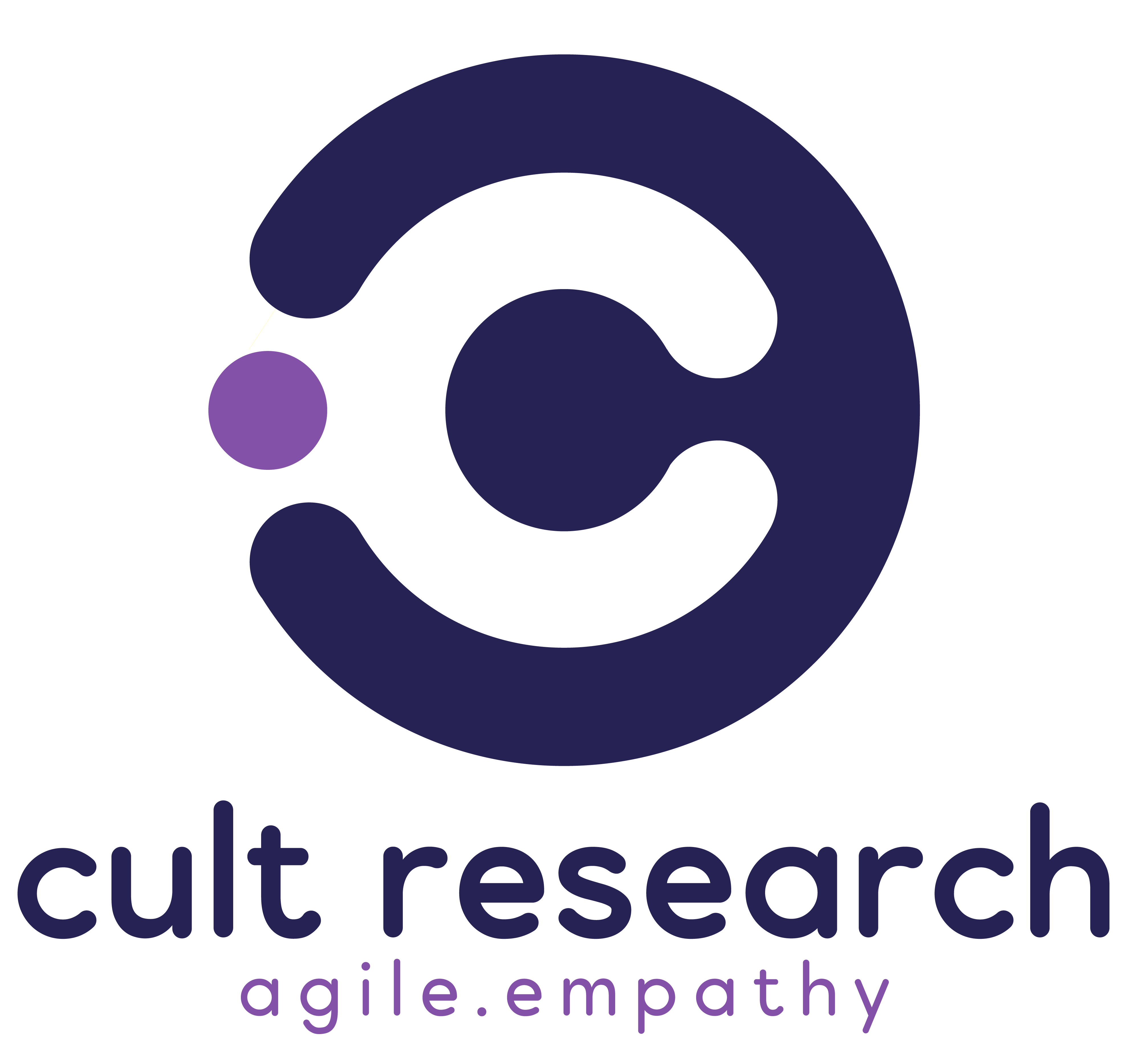
The logo adopts a minimalist approach and features circular and organic shapes that cleverly reveal the letter “C” within the negative space. In addition, the shapes incorporated in the logo create an abstract representation of the human brain. Furthermore, looking at the symbol from a different angle, one can also observe a person embracing” knowledge.”

Emblem

Horizontal Logo
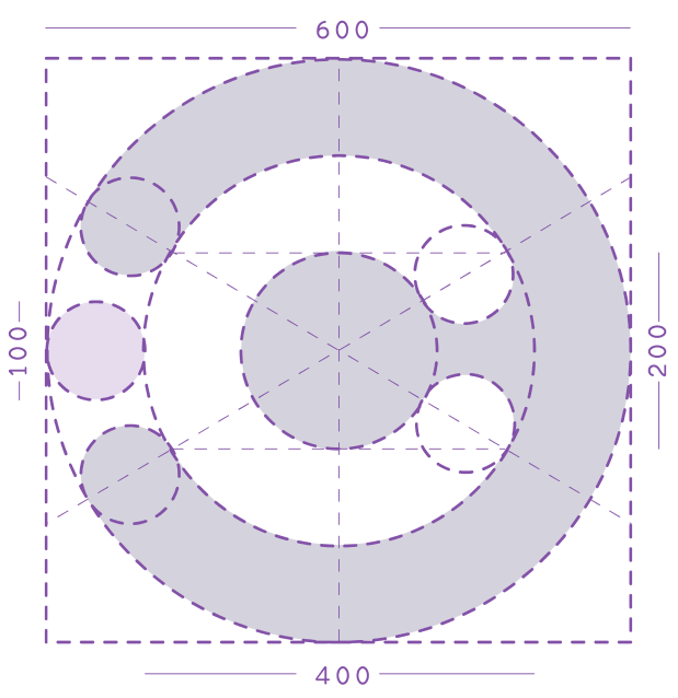
The logo comprises varying-sized circles, each with specific dimensions and proportions.
#fd9d7a
#8351a8
#262354
Alumatica – is a minimal and neat sans-serif font designed by Lukman Typia Nesia. It can easily be matched to an extensive set of projects, so add it to your creative ideas and notice how it makes them stand out.
The font “Poppins” is a versatile and modern typeface known for its clean lines, geometric shapes, and excellent legibility. With a contemporary and professional aesthetic, Poppins is well-suited for a wide range of applications, including branding, editorial design, and digital interfaces.
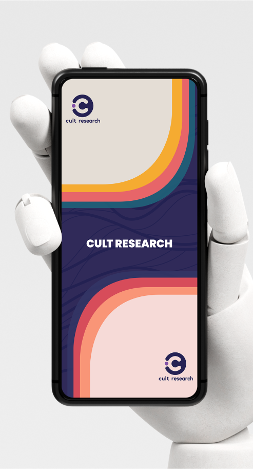
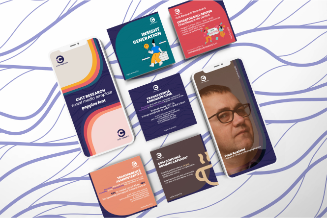

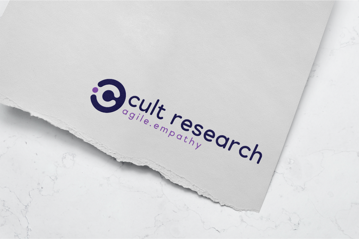

The project at hand encapsulates a transformative journey of reinventing and rebranding, focusing on enhancing performance through adaptive research consultancy, the graphic design process aimed to create a brand identity that would resonate with businesses, state institutions, and NGOs alike.