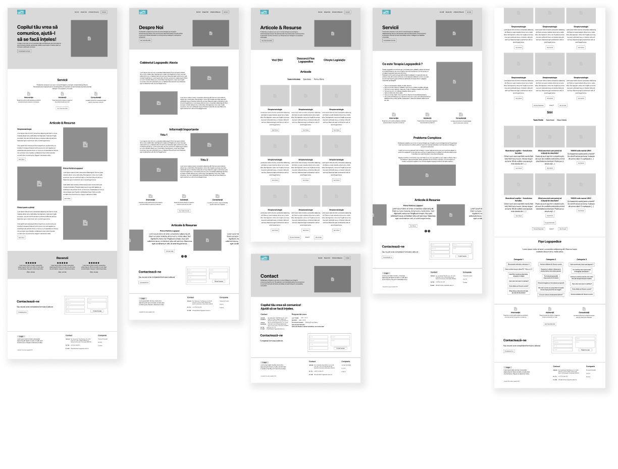
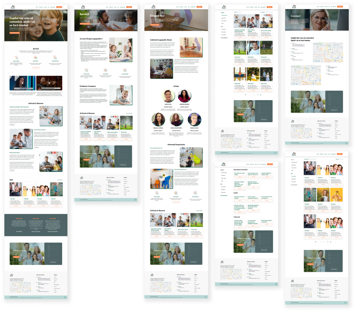
Alexia provides children with top-notch care and recovery services, emphasizing a highly empathetic approach. The project’s primary focus is to design an interface that caters to the unique needs of children and their families, promoting a sense of comfort and trust.
The clinic addresses a familiar problem parents face – the need to understand better their children’s state of mind and the process involved in their development. Parents often have numerous questions about how to navigate their child’s emotional well-being and the steps to follow after visits or during intervals between appointments.
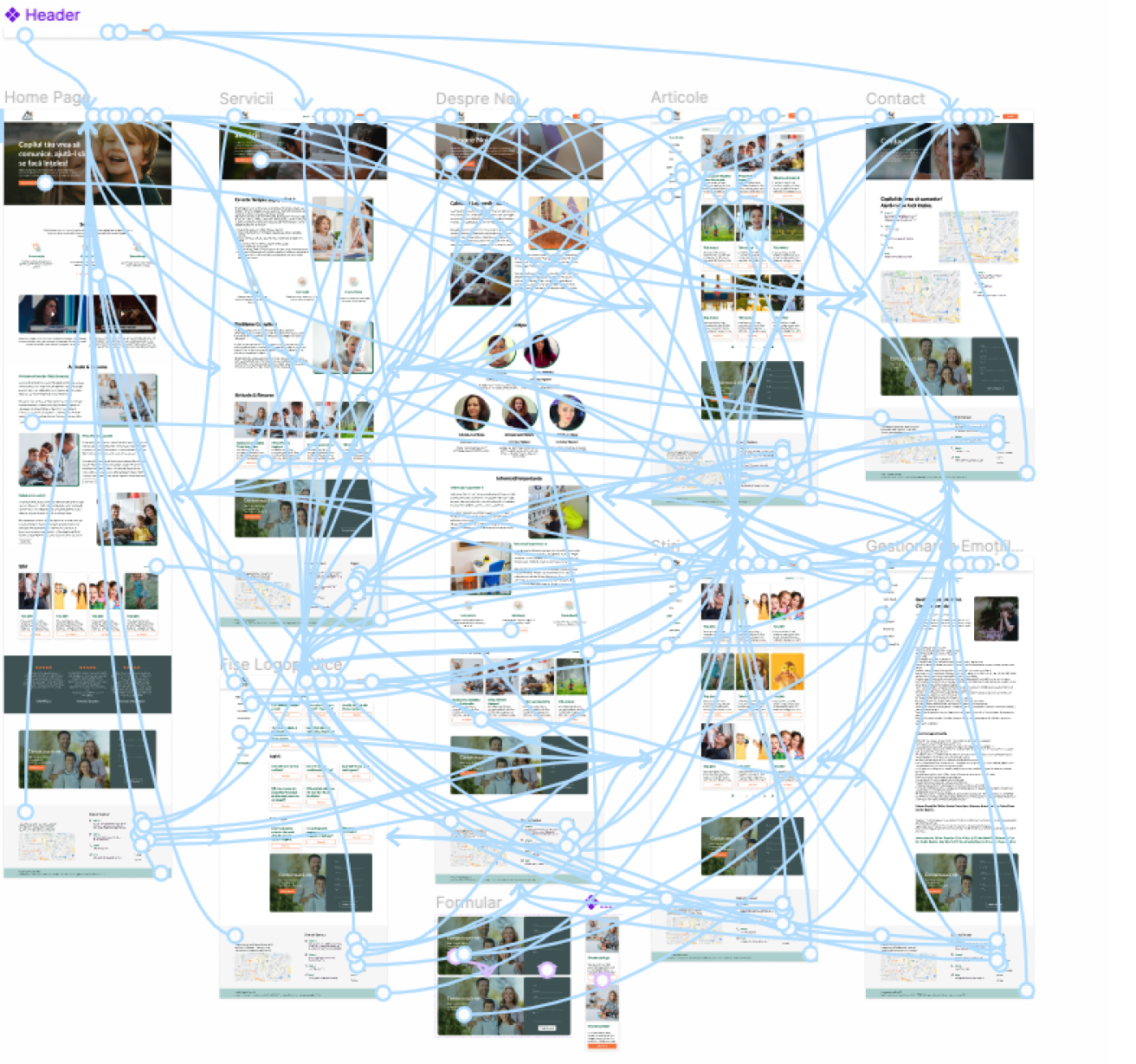
The project aims to offer a comprehensive platform for parents to better understand their children’s state of mind and development. It provides accessible communication with the clinic, downloadable exercise files for children, valuable information on the recovery process, and digital appointments for remote healthcare access. This holistic solution empowers parents to participate in their child’s progress actively, make informed decisions, and foster a stronger connection with their children’s well-being.

The color scheme for the UI project incorporates orange, green, and teal to create a warm contrast. Green is used to representing nature and evoke a soothing state, while teal adds a youthful touch.
#f6874f
#4e6466
#B8D8D6
Lato is a sans serif typeface family started in the summer of 2010 by Warsaw-based designer Łukasz Dziedzic (“Lato” means “Summer” in Polish). The semi-rounded details of the letters give Lato a feeling of warmth, while the strong structure provides stability and seriousness. “Male and female, serious but friendly. With the feeling of the Summer,” says Łukasz.


