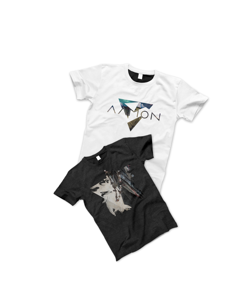
The logo for “Aamon,” a metal band, captures their modern and abstract essence with a visually striking design. Seven triangles, including one cleverly integrated into the negative space, represent the band’s members and symbolize strength and unity. A custom font adds a modern and futuristic touch, aligning with the band’s style. The pyramid shape, emphasizing the Trinity, adds deeper symbolism. The orientation of the triangles conveys meaning, with the downward triangle representing introspection and the upward triangles forming an abstract mountain, inspired by nature.