THE WEEKEND COFFEE SHOP

Company:

Role:

Tools:

Responsibilities:

Overview

Located in the heart of the bustling capital city, The Weekend coffee shop is a go-to destination for nearby companies seeking a quick and delicious pick-me-up. They strive to offer the highest quality coffee and snacks, making them a favorite among caffeine aficionados and foodies.

Problem Statement

Even though there are no direct competitors in the area, the competition is high in the coffee shop market. With numerous local coffee stops presenting as high quality, there is a considerable risk of falling into monotony.

Solution

The coffee shop needs a solid and distinctive brand to differentiate itself from the competition, break the monotony, and increase visibility from the street to attract passing potential customers.

THE BRAND PROPOSAL

Value Proposition

We offer lovers of superior-quality coffee a creative community where they will find specialty coffee, pastry products, and personalized gifts in a relaxed and cheerful atmosphere.

The Mission

We provide youth with inspiration and specialty coffee through a community that turns customers into urban heroes.

Brand Values

Slogan

„Your daily space of inspiration.”

Moodboard

LOGO PROPOSAL

Main Logo

With an Art Deco Inspiration that strikes the eye as being creative, versatile, and unique, the logo has resulted from intense market research and competition.
We can extract multiple elements from the primary logo to use throughout various design assets, both print and digital.

Emblem

Horizontal Logo

Fractal

This term was coined in 1975 to describe shapes that seem to exist at both the small-scale and large-scale levels in the same natural object. Fractals can be seen in snowflakes, in which the microscopic crystals that make up a flake look much like the flake itself.

Colors

When used together, beige and grey can create a sense 
of harmony and balance, with beige providing a soft and warm background, while grey offers a sleek and professional contrast.
#f6ebd9
#e0c194
#404751

Montserrat Black

Montserrat Bold

Montserrat Medium

Montserrat Light

Typography

Montserrat is a geometric sans-serif typeface designed by Argentinian designer Julieta Ulanovsky. It was inspired by signage and typography from the Montserrat neighborhood in Buenos Aires, Argentina, which is known for its Art Deco architecture.

Bistro Icon

Other Icons

PRINT ASSETS

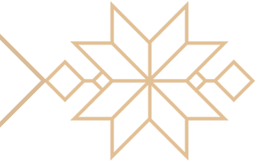
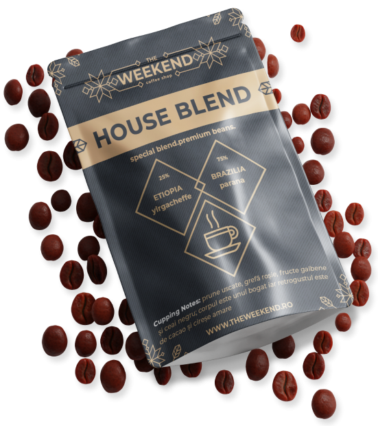
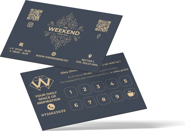
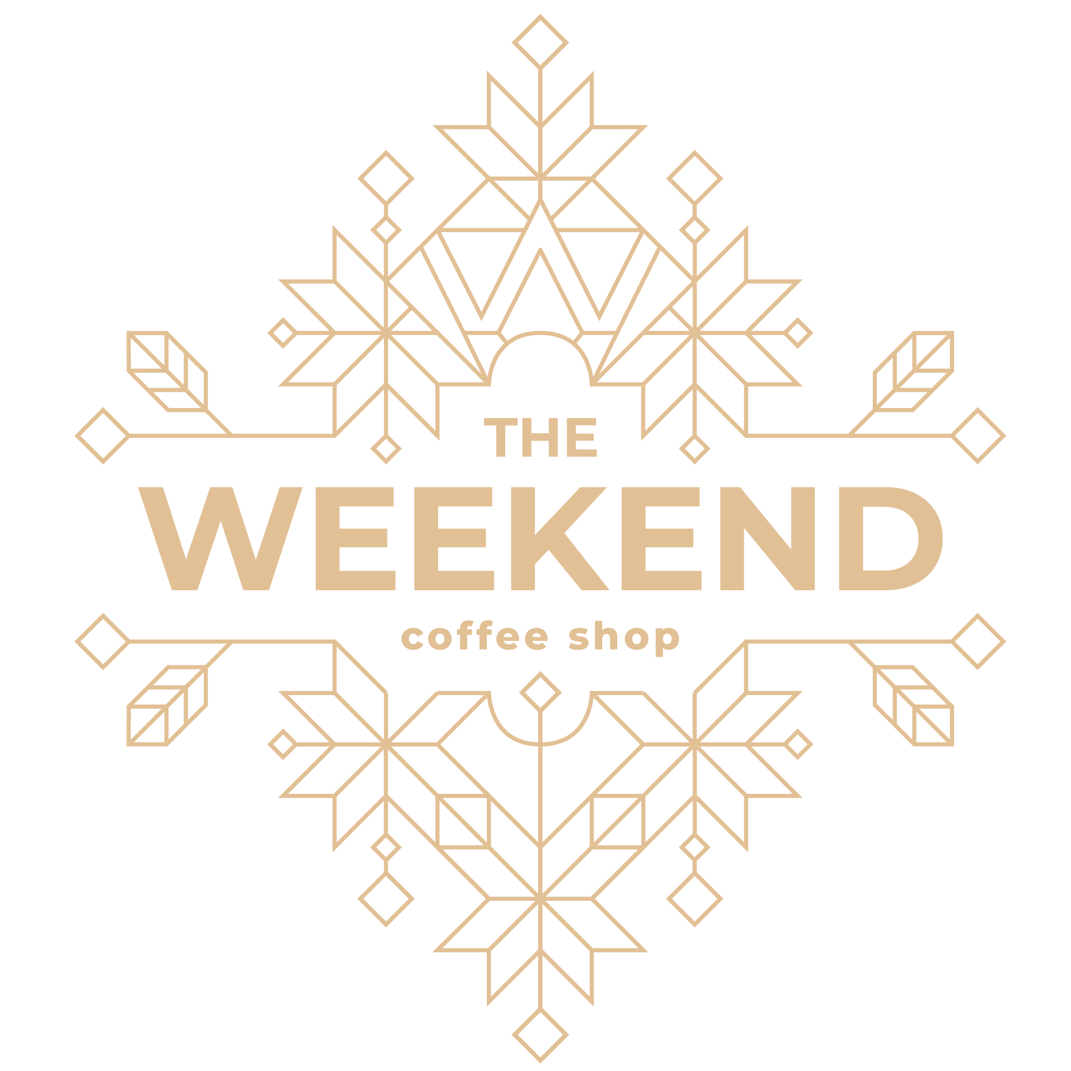
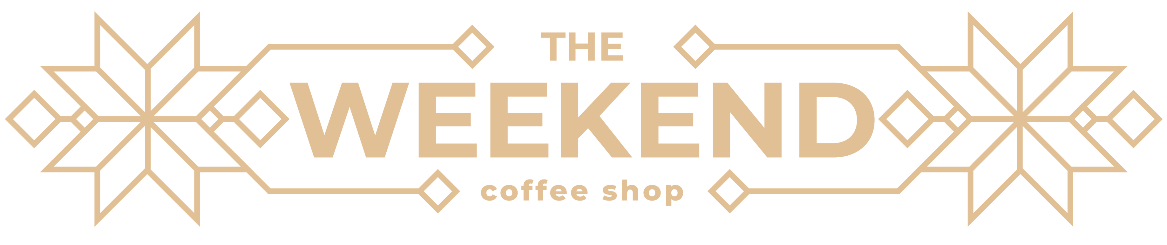
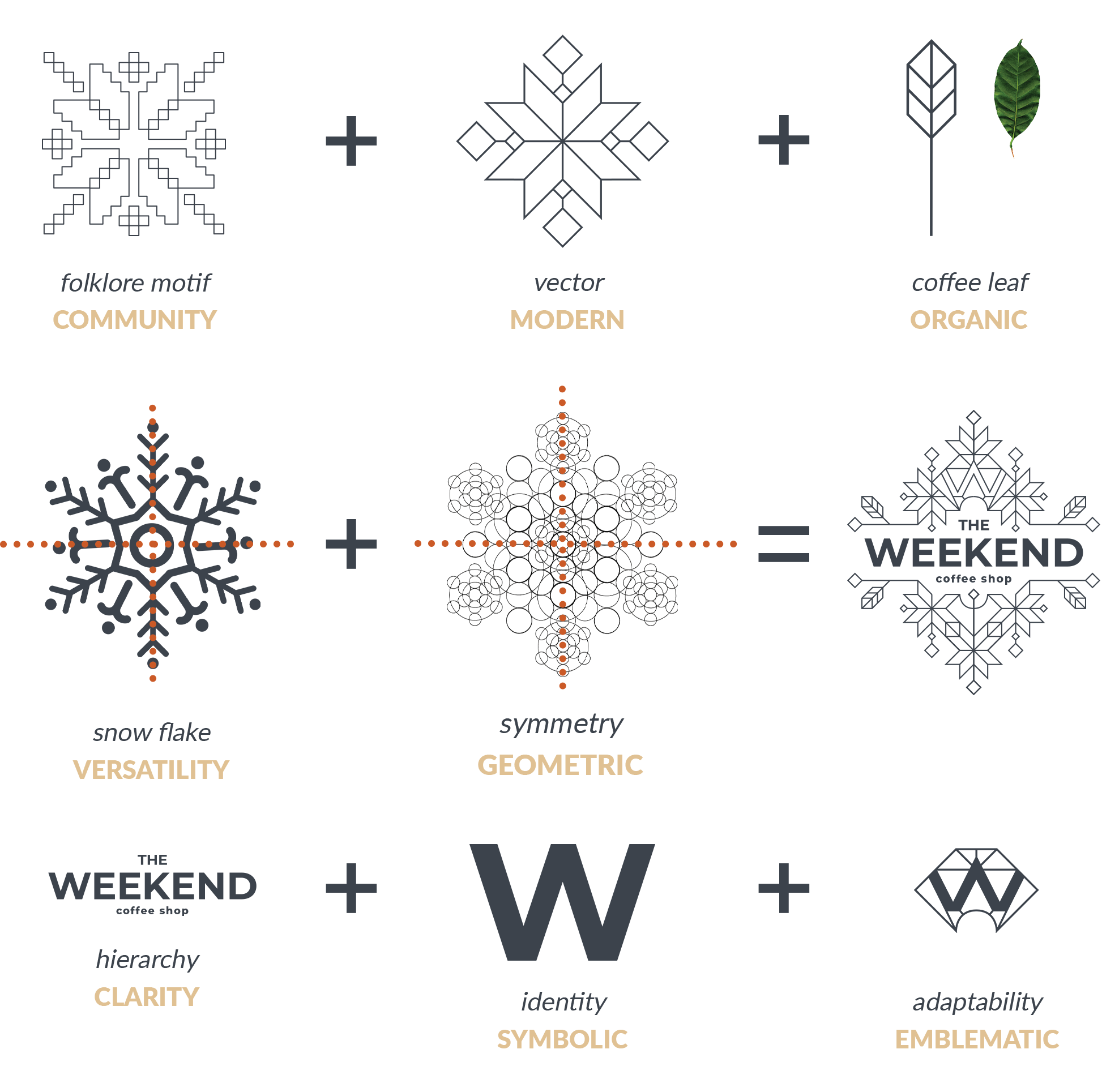
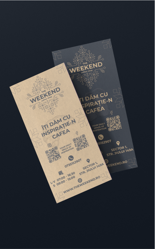
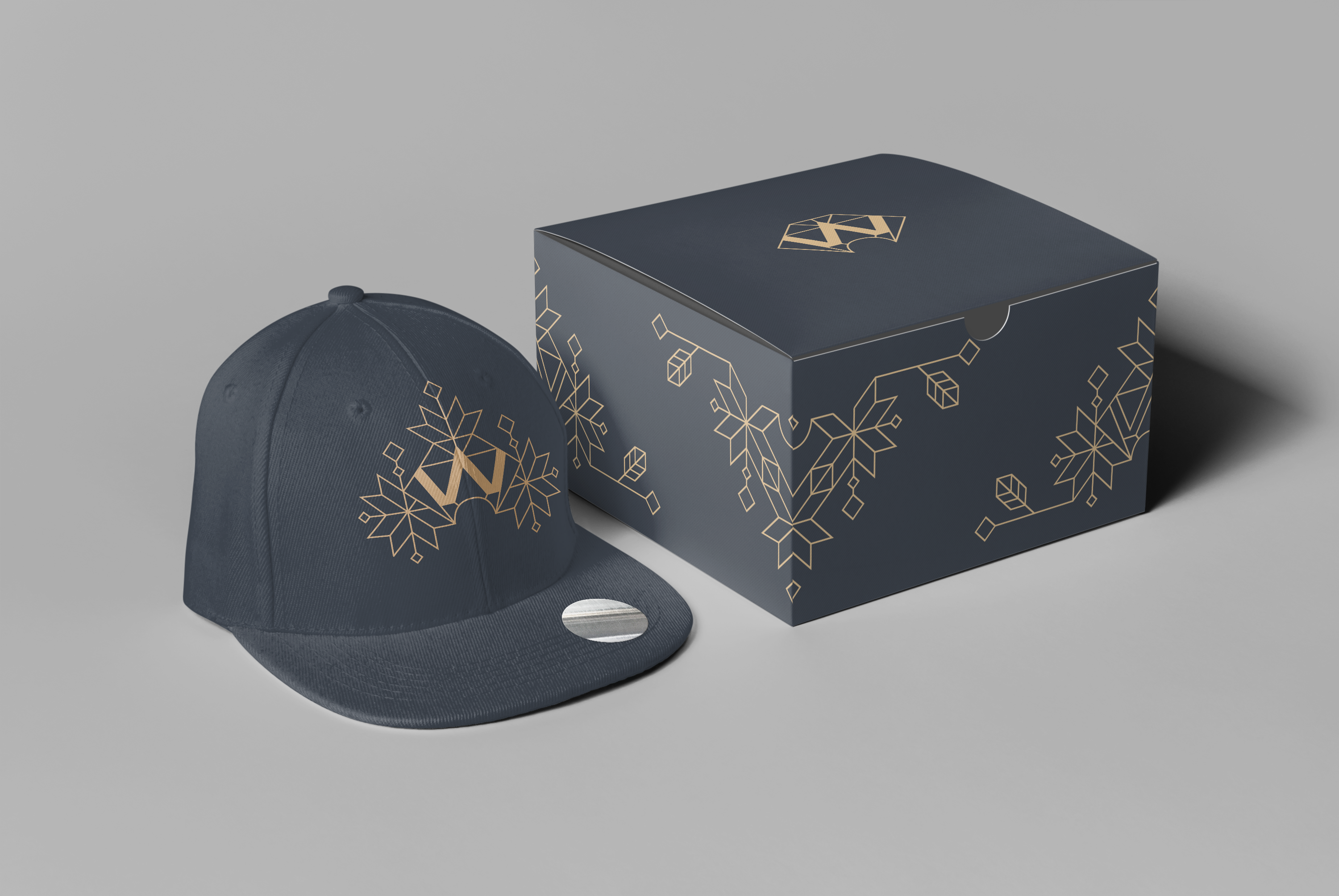
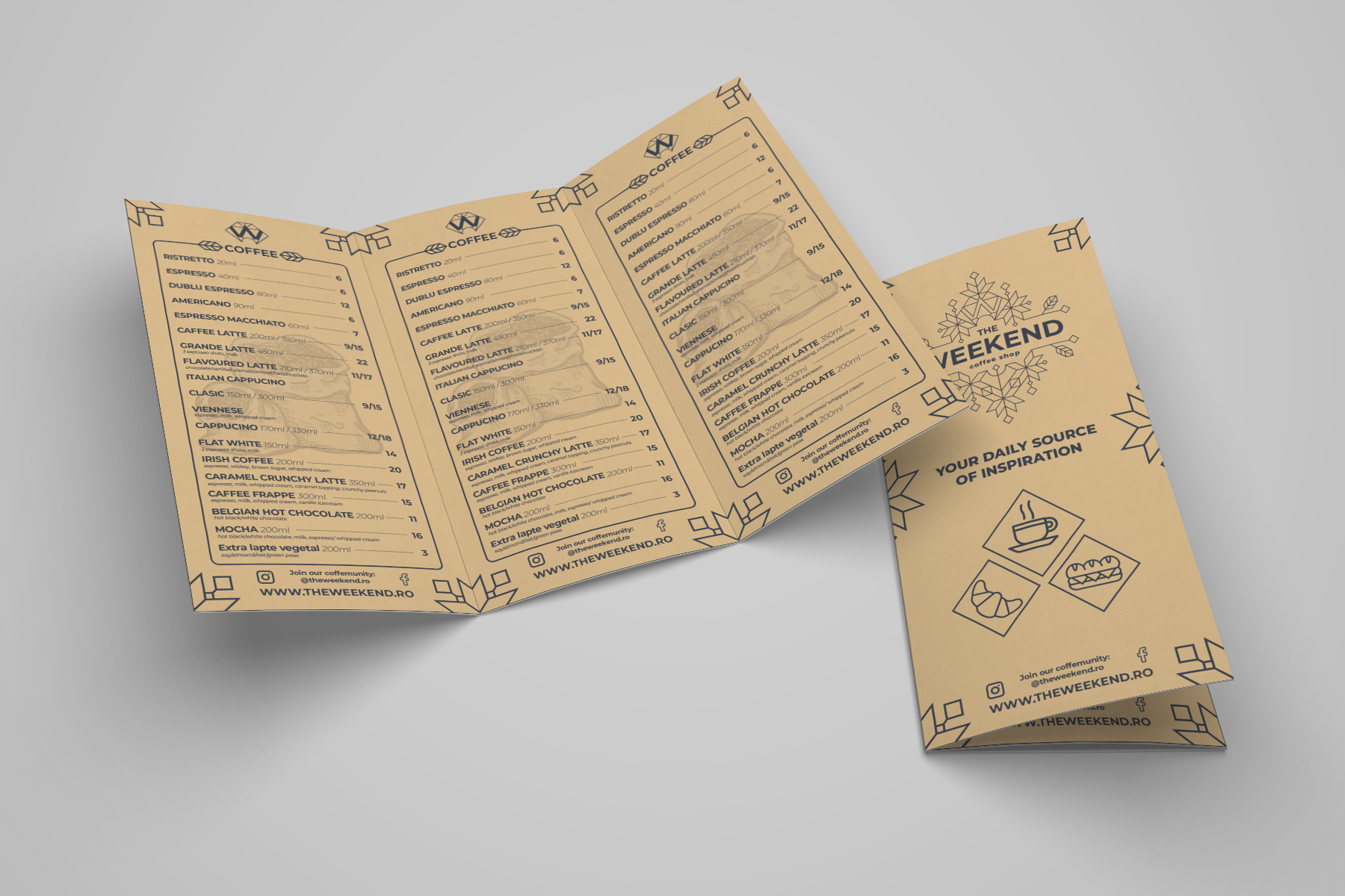
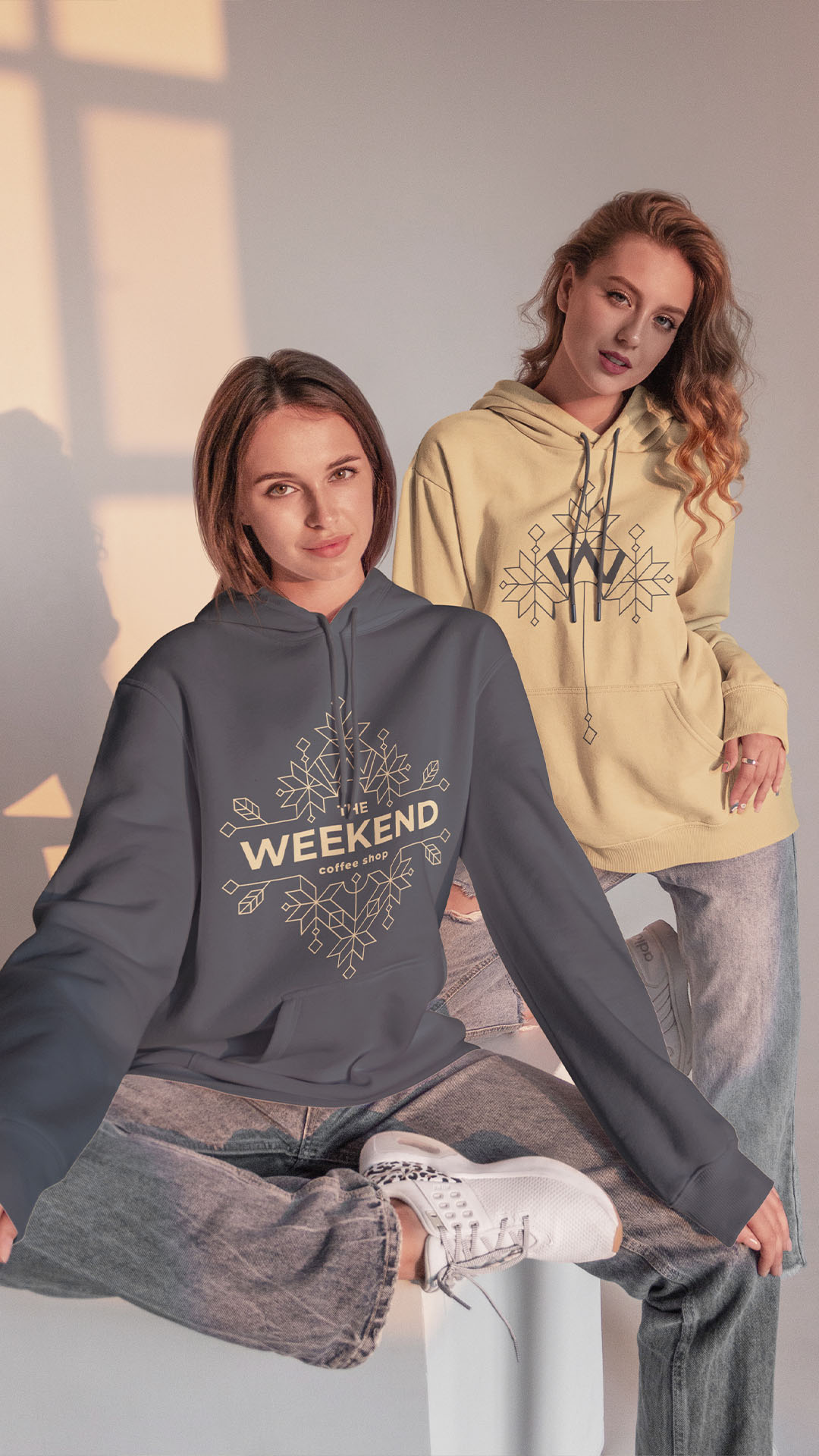
The design process, driven by creativity, energy, quality, and versatility, took inspiration from Art Deco elements, resulting in a logo that stood out as creative, unique, and adaptable. The logo’s fractal-like shapes offered a sense of continuity and captured the essence of natural beauty. Combining beige and grey, the color palette achieved a harmonious balance, providing a warm and inviting background juxtaposed with a sleek and professional contrast.